MIA BY TANISHQ
MIA BY TANISHQ
MIA BY TANISHQ
e-commerce
mobile app Revamp
e-commerce
mobile app Revamp
Improving how customers review, manage, and complete their jewellery purchases within the MiaByTanishq ecosystem.
Improving how customers review, manage, and complete their jewellery purchases within the MiaByTanishq ecosystem.
Improving how customers review, manage, and complete their jewellery purchases within the MiaByTanishq ecosystem.
Design Scalability
Design Scalability
Design Scalability
Atomic Methodology
Atomic Methodology
Atomic Methodology
Component Library
Component Library
Component Library
CONTEXT
CONTEXT
CONTEXT
Mia by Tanishq is a cheerful, expressive jewellery brand by Titan, known for its youthful identity. While the website had been gaining traction, the app existed as a functional placeholder built to have a channel rather than to serve a shopper. The product team decided it was time to change that.
Mia by Tanishq is a cheerful, expressive jewellery brand by Titan, known for its youthful identity. While the website had been gaining traction, the app existed as a functional placeholder built to have a channel rather than to serve a shopper. The product team decided it was time to change that.
Mia by Tanishq is a cheerful, expressive jewellery brand by Titan, known for its youthful identity. While the website had been gaining traction, the app existed as a functional placeholder built to have a channel rather than to serve a shopper. The product team decided it was time to change that.
Re-brief after research
Fix the lack of a "golden path", the haphazard structure blocking discovery. Build an intuitive flow and bring Mia's youthful brand identity to the app.
Re-brief after research
Fix the lack of a "golden path", the haphazard structure blocking discovery. Build an intuitive flow and bring Mia's youthful brand identity to the app.
SCOPE
SCOPE
SCOPE
User Experience
User Research
Usability Testing
Interface Design
User Experience
User Research
Usability Testing
Interface Design
User Experience
User Research
Usability Testing
Interface Design
ROLE
ROLE
ROLE
UX Designer
UX Designer
UX Designer
TIMELINE
TIMELINE
TIMELINE
4 Weeks
4 Weeks
4 Weeks
DISCOVERY
DISCOVERY
DISCOVERY
Before touching any designs, I needed to understand what was actually broken — not just what looked off. I used three research methods to build that picture.
Before touching any designs, I needed to understand what was actually broken — not just what looked off. I used three research methods to build that picture.
Before touching any designs, I needed to understand what was actually broken — not just what looked off. I used three research methods to build that picture.
App diagnostic and competitor analysis:
Audited the existing app against direct competitors, audience-favourite apps, and best-in-class Indian apps to identify structural and visual gaps.
App diagnostic and competitor analysis:
Audited the existing app against direct competitors, audience-favourite apps, and best-in-class Indian apps to identify structural and visual gaps.
App diagnostic and competitor analysis:
Audited the existing app against direct competitors, audience-favourite apps, and best-in-class Indian apps to identify structural and visual gaps.
In-store Contextual Inquiry:
Visited two Mia stores in Indiranagar, Bangalore. Spoke with store staff to understand how customers discover and decide, and observed how physical retail guides users from accessible to premium in a way the app did not.
In-store Contextual Inquiry:
Visited two Mia stores in Indiranagar, Bangalore. Spoke with store staff to understand how customers discover and decide, and observed how physical retail guides users from accessible to premium in a way the app did not.
In-store Contextual Inquiry:
Visited two Mia stores in Indiranagar, Bangalore. Spoke with store staff to understand how customers discover and decide, and observed how physical retail guides users from accessible to premium in a way the app did not.
Google Analytics 4:
Found that 80% of app users arrived directly from Mia's Instagram — meaning they came in with strong visual expectations the app was not meeting.
Google Analytics 4:
Found that 80% of app users arrived directly from Mia's Instagram — meaning they came in with strong visual expectations the app was not meeting.
Google Analytics 4:
Found that 80% of app users arrived directly from Mia's Instagram — meaning they came in with strong visual expectations the app was not meeting.
CHALLENGE
CHALLENGE
CHALLENGE
How might we create a discovery experience that feels as intuitive as browsing in-store & on brand's socials?
How might we create a discovery experience that feels as intuitive as browsing in-store & on brand's socials?
The app did not lack content — it lacked structure. Users had no guided path from arrival to purchase, and the visual language felt disconnected from every other touchpoint of the brand. Both problems needed to be solved together.
The app did not lack content — it lacked structure. Users had no guided path from arrival to purchase, and the visual language felt disconnected from every other touchpoint of the brand. Both problems needed to be solved together.
Categories appeared as the hero section on almost every page, top and bottom navigation consumed too much screen space, and the colour system was inconsistent across screens.
Categories appeared as the hero section on almost every page, top and bottom navigation consumed too much screen space, and the colour system was inconsistent across screens.
The brief: redesign the navigation, home page, categories page, and product listing page (PLP), to be released across multiple sprints.
SYNTHESIS
SYNTHESIS
SYNTHESIS
Research revealed that users were arriving with strong visual expectations from Instagram, but landing in an app with no guided discovery path. The new design mirrors how Mia stores work in person, layering the experience from exploration to intent, while anchoring the visual system to the Instagram identity users already know.
Research revealed that users were arriving with strong visual expectations from Instagram, but landing in an app with no guided discovery path. The new design mirrors how Mia stores work in person, layering the experience from exploration to intent, while anchoring the visual system to the Instagram identity users already know.
Research revealed that users were arriving with strong visual expectations from Instagram, but landing in an app with no guided discovery path. The new design mirrors how Mia stores work in person, layering the experience from exploration to intent, while anchoring the visual system to the Instagram identity users already know.
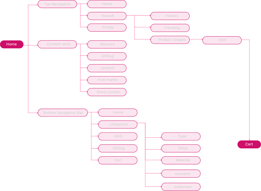

KEY DECISIONS → NAVIGATION
KEY DECISIONS → NAVIGATION
KEY DECISIONS → NAVIGATION
Given that increasing user engagement on the home page was the primary business metric, I redesigned the navigation to prioritise scrollability — keeping the home page open and explorable rather than routing users away immediately.
Given that increasing user engagement on the home page was the primary business metric, I redesigned the navigation to prioritise scrollability — keeping the home page open and explorable rather than routing users away immediately.
A key finding: navigation panels were inconsistent across pages, and disappeared entirely on some screens. Fixing this became the first release priority.
A key finding: navigation panels were inconsistent across pages, and disappeared entirely on some screens. Fixing this became the first release priority.
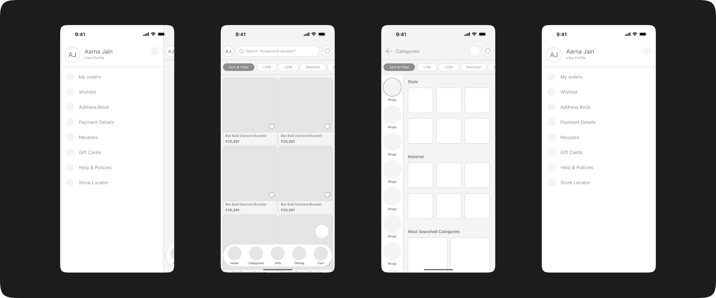
CATEGORIES PAGE
CATEGORIES PAGE
CATEGORIES PAGE
This page involved the most debate. Research from a Google workshop on shopper insights pointed in one direction; internal company data pointed in another. I advocated for organising the page by product categories and subcategories for clarity. The product team preferred listing all categories and subcategories together for maximum visibility.
This page involved the most debate. Research from a Google workshop on shopper insights pointed in one direction; internal company data pointed in another. I advocated for organising the page by product categories and subcategories for clarity. The product team preferred listing all categories and subcategories together for maximum visibility.
PRODUCT LISTING PAGE
PRODUCT LISTING PAGE
PRODUCT LISTING PAGE
The PLP was cluttered with fragmented controls. I grouped related elements — filters, sort, and smart filters — together, and increased the product image size on cards to reduce the need to tap into the PDP just to see the product clearly.
The PLP was cluttered with fragmented controls. I grouped related elements — filters, sort, and smart filters — together, and increased the product image size on cards to reduce the need to tap into the PDP just to see the product clearly.
A key finding: navigation panels were inconsistent across pages, and disappeared entirely on some screens. Fixing this became the first release priority.
A key finding: navigation panels were inconsistent across pages, and disappeared entirely on some screens. Fixing this became the first release priority.